Concentration
Technologies
- HTML5
- CSS3
- jQuery
About
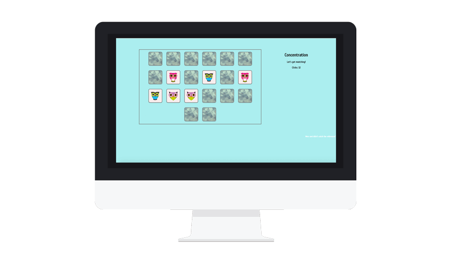
This is a re-creation of the popular kids' game Concentration using a combination of HTML, CSS and jQuery.
I wanted to make this version more adult-friendly by making the matches harder (all of the images are of the same general thing - owls - and feature the same color palette and basic shapes). I also included a mechanism by which to gauge improvement by adding a simple click counter. You also get a surprise lightswitch rave if you match all tiles - and the main game board state features an Easter egg to explain the pop culture reference.
R E S T
Technologies
- Ruby
- Active Record
- psql
- Database Architecture
- Wireframing
- User Stories
About
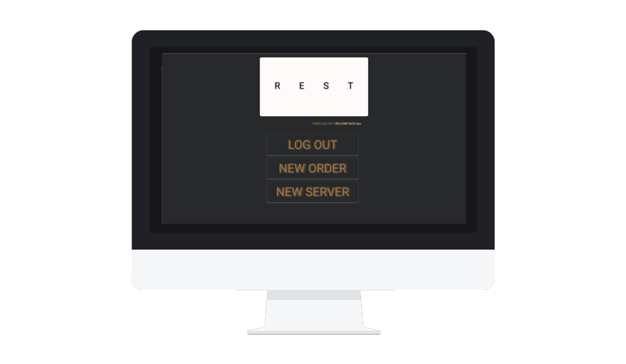
This is a RESTful CRUD application built as a point-of-sale interface for restaurant servers. This app was created in Ruby using a SQL database (psql).
Admin Login
Username: taco
Password: bell
R E S T was created with the mobile user in mind (I had envisioned servers with iPads when coming up with the minimalist design and oversized buttons). Users (servers) can create tables, take orders, amend orders and delete them by marking the bill as paid. Managers have admin access and can add new servers, as well as edit and create new menu items.
HipSpace
Technologies
- Node.js
- Express.js
- Mongo dB
- Angular JS
- Agile Workflow
- SCRUM Sprint
- Delegation
- Planning
- Teaching
- Wireframing
- User Stories
- Graphic Design
About
HipSpace is a group project I worked on with other developers + a project management team. I served as lead front end developer of the group and was in charge of the creative direction of the site and coding the front end of all but the profile page. This app was created using a combination of Node.js, Express, MongoDb, Mongoose and the Semantic UI framework.
Login
Username: carolyn
Password: carolyn
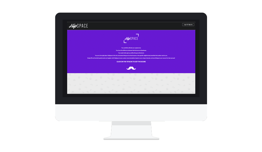
HipSpace was created to answer the age old question: where should I live? Users take a quiz, answering questions on their preferences, and are given their HipScore and corresponding neighborhood they should live in. Users can then explore their new neighborhood and find what matters most to them.
Users can then create an account to store their result and re-visit that neighborhood whenever they want to. Users can also update their quiz answers if thier priorities shift.
Dead Rabbit Society Taskmaster
Technologies
- Node.js
- Express.js
- Mongo dB
- AngularJS
- API Creation
- API Consumption
About
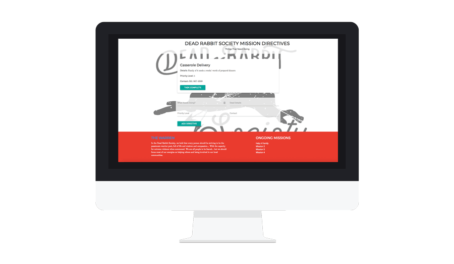
Project Task Manager for Dead Rabbit Society Campaigns. The Dead Rabbit Society is a veteran-run charity organization formed as a way for former service members and likeminded people to give back to their communities and make a tangible difference. This task manager is a way volunteers can see what remains to be done with each charity project, and what priority each task carries. This app was created in the MEAN stack using Mongo dB, Express.js, Angular and Node.js.
Game Of Fitness
Technologies
- Ruby
- psql
- HTML5
- CSS3
- AngularJS
- Wireframes
- User Stories
- Graphic Design
About
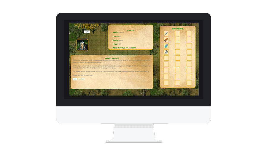
Game of Fitness is a card-based workout of the day applicaiton based on a simple fitness card game - each suit (in this case Enchantment, Land, Sorcery and Tribal instead of Spade, Club, Heart and Diamond) is assigned an exercise and each card value corresponds to the number of reps required. The workout is completed when all 52 cards have been dealt. This app was created in Ruby using a SQL database (psql) and consumes an API I created using AngularJS.
Login
Username: veronica
Password: one
Game of Fitness was created with a particular group in mind (an online network I am a part of). Users can create accounts, deal random workouts, mark individual exercises as complete, and earn mana points for each exercise they do.
In version 2, I hope to include some sort of boss battle mechanism utilizing loot that the player also earns by completing workouts.
Daily CSS Images
Technologies
- HTML5
- CSS3
- SVGs
- Animations
About
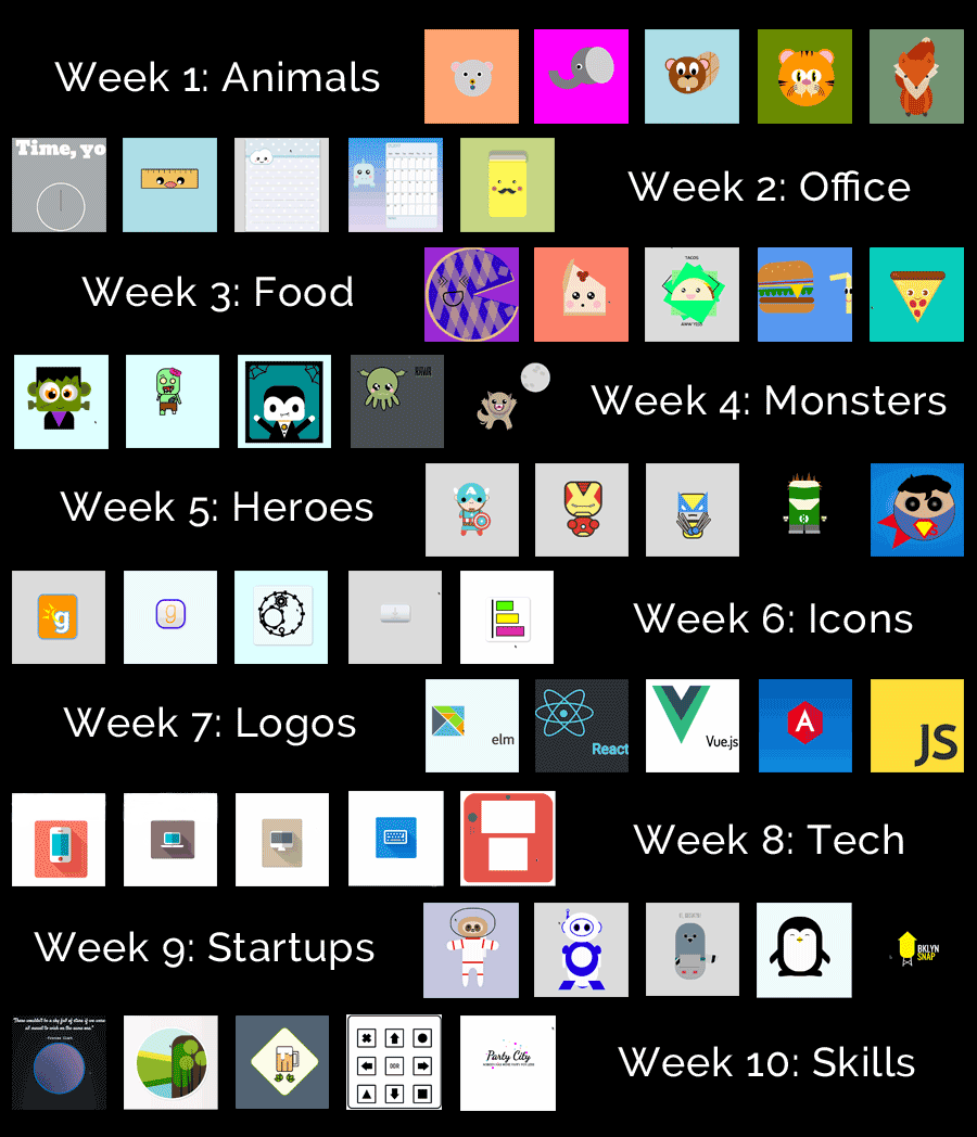
This is a collection of images I created in CodePen using pure CSS and HTML. This is from the #dailycssimages project which provides a drawing prompt a day for 50 days in an effort to build your CSS skills.
Week 1: Animals
This first week was all about animals. My first couple were kind of rough, but by weeks' end, my work was being featured in the weekly showcase newsletter.
Week 2: Office Supplies
I discovered a love of making kawaii office supplies this week, adding the challenge of making different faces to simple items. I also started playing with gradients and animations this week.
Week 3: Food
More kawaii inanimate objects. This week, three out of five designs were animated in some way - while my blueberry pie didn't work out quite as planned on the perspective front, I love the squinty eyes.
Week 4: Monsters
These monsters were a lot of fun and I was happy to see two featured in the weekly showcase. I particularly love my Cthulu (which was the one that took the longest and caused the most frustration) and my Frank - he's just adorable.
Week 5: Superheroes
This week was awesome - for the most part. My Cap and Iron man were singled out for the newsletter, and while my Superman's S didn't quite do what I wanted it to and my Green Lantern wouldn't play nice no matter what I did, I had more than enough fun with the other three designs.
Week 6: Icons
This week was pure animations and SVG work. I designed two icons for a startup I work with, gears that *almost* make logical sense, an annoying in the most minimalist way possible download button, and a really cool graph with neat color and border transitions.
Week 7: Tech Logos
This week's tech logos were relatively quick to put together - even when research on the correct fonts didn't quite pan out.
Week 8: Tech Hardware
This week, I went for a combination of flat design and shading for icon-style renderings of hardware. I couldn't stray too far from animations and subtly animated the keyboard. I was also surprised to see my laptop design featured in the weekly showcase - I struggled with the shadows on that one for hours, and it wasn't as perfect as I'd have liked.
Week 9: Mascots for Startups
Mascots. I'm rather proud of the animated pigeon (featured) and penguin and the logo I made for my husband's photography. The sloth was the start of my next week's obsession with space.
Week 10: Mix and Match
This was the last week, and I was sad to see the end. This week, four of my designs were feautred - I made an homage to my current favorite iPhone game (Dots & Co.), created a beer logo, revamped the Party City logo, and made a cool window into space.